The week between Christmas and New Years' my Patrone and I took a trip to Hawaii. I love the water, and I love being in the water, and so we had scheduled a scuba diving lesson, one of the things still on my bucket list.
However, it was canceled because of a "rough, wintery day". In Hawaii. This means, I've figure out, that it's cloudy and the wind is blowing.
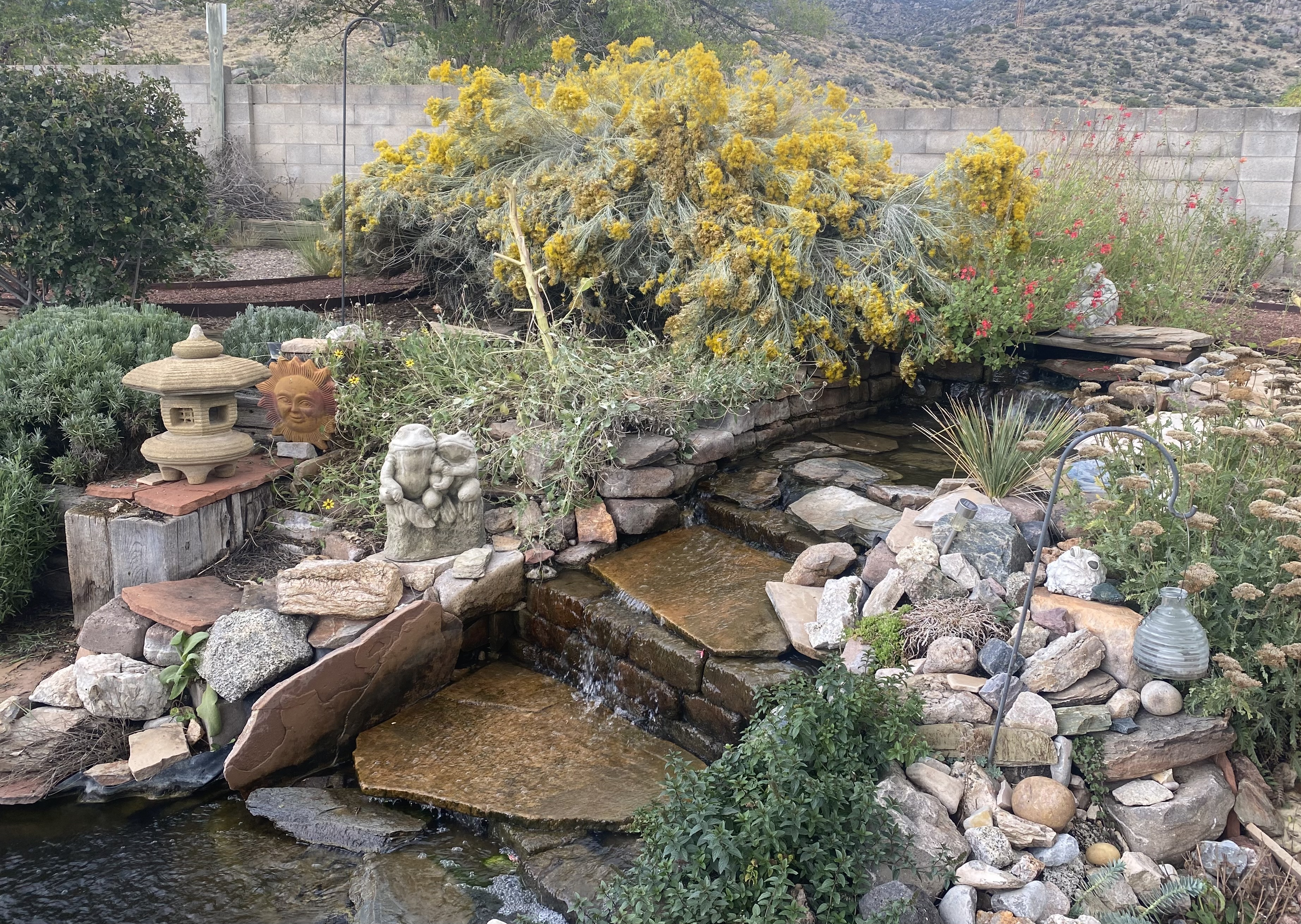
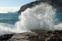
Now, I've always shied away from painting water, especially waves. It just looks difficult. I took this
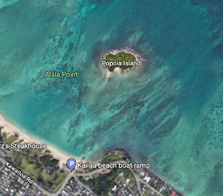
picture from "flat island" or Popoi Island. It's a tiny island, barely a dot even on a close up on Google Earth. We had kayaked out there in a rented kayak in choppy seas and wandered around on it.
My reference photo: Flat Island in Hawaii
In taking this picture, I stood for quite some time trying to capture a large splash made by the choppy seas. It didn't work. Every time I turned my back, BIG SPLASH. When I turned around, the best I got was the one above.
Nevertheless, I decided to try my hand at painting the ocean, and spray.
Saturday.
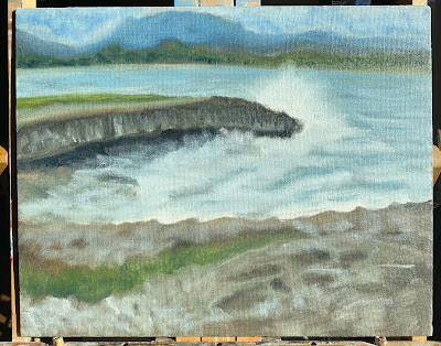
My first pass was using a palette of mainly Portland Gray, Ultramarine, Raw Umber, Italian Green Umber, Cerulean, Cad Yellow Light, and Unbleached titanium, leaving parts of the canvas white. I decided I didn't like the way the clouds cut off the distant mountain so I left it in. I swirled some darker color through the water here and there, the same way I'll lightly swirl white through the skies in my southwestern landscapes when I'm painting contrails.
I think I did pretty well on capturing the main colors; however, I don't like how dark and almost monochromatic it seems. I'm also not happy with ow the distant mountain goes off the canvas.
Sunday
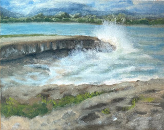
My 2nd pass:I chopped the top off that distant mountain and while I was at it, pretended it wasn't a completely cloudy day by adding more chroma into the sky and brightening up the clouds a bit (I remember when I was a little girl, and I pointed out that something on my mother's canvas wasn't in the picture she was using. That's called 'artistic license,' she explained. I thought it was just plain lying. But now I get it. )
I also figure out that frothy water was easy enough: scrub, scrub, scrub the while into the blue using the bristle brush. I scrubbed outward to the edges of the froth, turning my canvas when I did that.
I added some of the leftover teal I used for the shoreline trees (Italian green umber + Cerulean) to zinc/tit white, for the center of the spray. I used this for the froth coming up on to the little rise underneath the overhang, and then added in a little more white for the outer edges of the spray.
Okay, I'm reasonably happy with the direction this is headed.
But....I don't like that dark band cutting across the bottom 1/3 of the canvas. I could painting out everything above the greenery and turn it into sea. However, I. Am Lazy. so I thought I would just lighten it up instead. I also feel like the shoreline is not straight enough, but maybe I don't care enough to do something about it.
I'm also not crazy about how the outcropping curved down, like a frown. It's straighter in the photo. That may be pretty hard to correct, so I may cover it with spray.
Most of all, however, I note that my focal point - the spray hitting the edge of the island - is pretty small. Much smaller than it deserves. No matter how long I stayed in one place trying to capture a nice big splash, they all looked like that until the moment I lowered my camera.
It's what I was trying to photograph, and I feel it needs more attention in the painting. I looked for some more reference photos, which I found easily on the internet searching for sea spray on rocks.
 I notice that there is actually a shadow
 in the spray on the side away from the sun. See that? I also see that on the outer edges of the spray are some round drops hitting the sun, which I imagine can be rendered by stippling. But that will come much later in the painting.
For now, titanium white and the cads tend to take forever to set, so hopefully this will be at least tacky-dry in a couple of days to add more into the spray.
Day 3
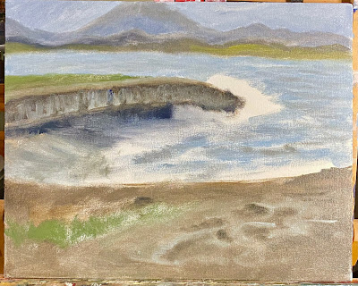
Now I've added in more chroma, and some brights on the trees, hills, and clouds. I'm pretending it wasn't a cloudy day when I took the original picture. I've warmed up the foreground, too. I know, I know -- it's basalt, it usually isn't that warm, except when it is - when it's highly oxidized, it's not gray and "wintery" out, and there's sand blown over it. I'm pretty satisfied with the background, I think it reflects the party-cloudy aspect of "winter" in Hawaii as I've come to know it.
The shoreline still seems too wavy, and I'm still not completely satisfied with the amount of spray, but I really need to leave this alone and let it dry before I mess with it any more. ]
But...
And it's just a little too blue. The foam is too blue, and the hills in the background are too stipled, making them look more like the tops of trees, at least to me. I feel like I need to add back some more warm white into the foam and froth approaching the rock, and I still want to make the spray a little bigger. Overall I'm satisfied with the rock, and with the greenery.
And maybe I've made the ocean a little too blue.
Okay.
GAAHHHH. I need to leave this alone and do other things.
More to come.
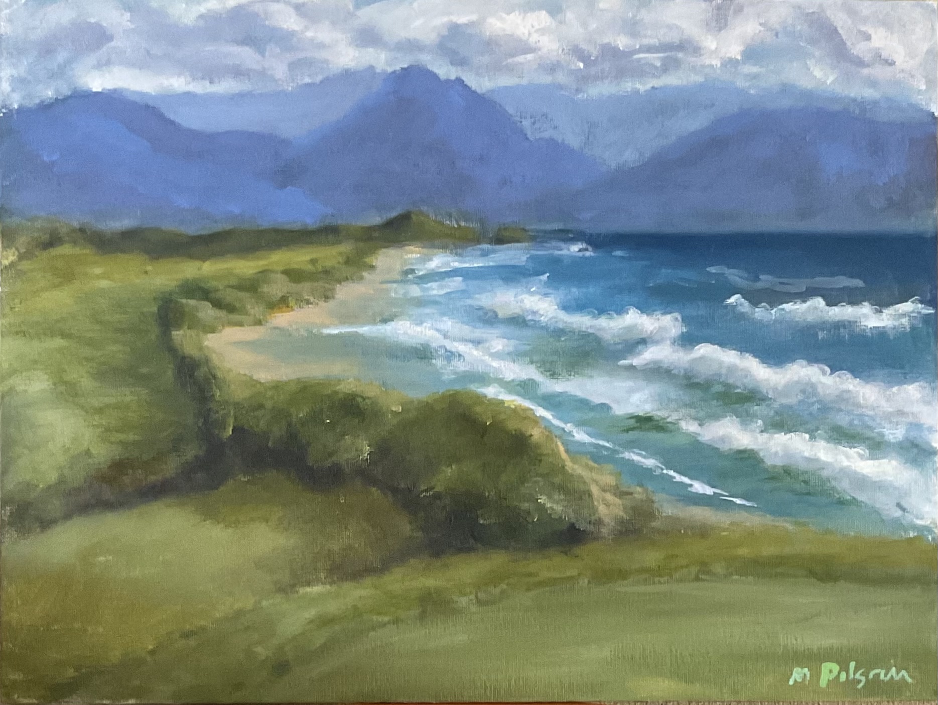
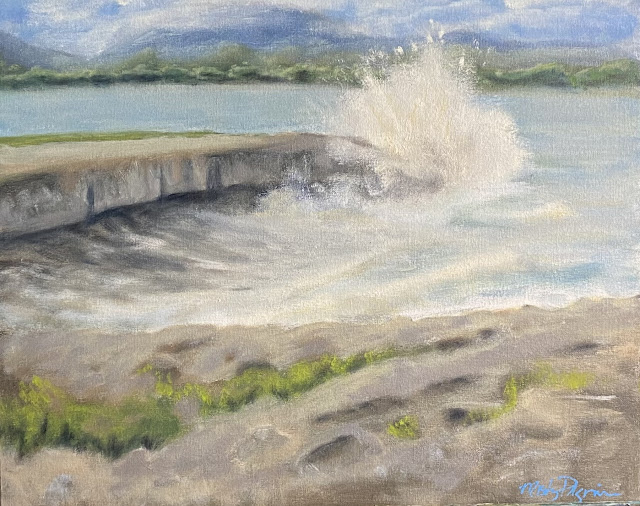
Last pass: and I know, because I signed it.
I went in with unbleached titanium, and warmed up the water and spray a bit, and spent a little more time on the spray. I also scrambled some purply gray over the rocks a bit. I tried to create a bit more form within the spray using the warm white mixed with purply gray.
Oh, but I had to get the last word in...I added some warm white to the sea foam to give it depth, and added back in some darks near the rock on the left so as to indicate that the water was receding, rather than advancing.
Finally, I warmed and lightened up the foreground because it was too dark, both compositionally, and according to landscape principles. I also added shadows under the trees on the shoreline.
And so now I'm done.
...
....